Case Study
When I joined Insights in late 2020, early release builds of the new Insights Practitioner platform were in mid-development. The new system was intended to replace an old piece of software that had several usability and compliance issues and some lucrative customer relationships were dependent on being able to deliver quickly. There was something of a stop-gap design system in place to facilitate this work but it was clear it would need to be replaced to scale effectively for the initial early roadmap.
The Insights R&D department was very new and was attempting to implement the double diamond as its core UX methodology. I spent my first few months collaborating with researchers and service designers to better understand customers and our internal client services team as well as developing a scaleable design system that would enable rapid prototyping for my team. I also upskilled and prioritised work for new junior interaction designers while delivering and demoing prototypes to three development squads, all working on different aspects of the new product, to help maintain their momentum.
By mid 2021, now confident that they could handle it, each designer was assigned a development squad that needed design support to represent and produce visuals and prototypes for. With a solid design system now in place, my role became more about coaching them through solving problems on a day-to-day basis and collaborating with research and product to finalise requirements and validate proposed approaches. We worked together to set standards for how we complete, present and document our work including a design index, microcopy guidelines and accessibility checklists. We also checked in weekly to ensure that workloads weren’t overwhelming, good relationships were forming and design feedback was being taken seriously. While my team worked on isolated features in separate squads, I took a holistic view of the platform as a whole and tried to maintain consistency and usability.
With a longer term roadmap often in flux, we had the advantage of a feature-rich existing system to pull high level examples of potential future functions to experiment with collectively during downtime. This helped build skills and form strong bonds within the team while giving us a foundation on which to build when features like these were eventually prioritised, at least in terms of understanding. We regularly evolved and refactored the design system together, eventually using Figma’s new auto-layout and variants features to significantly improve workflow, and frequently produced prototype tests using Maze to validate assumptions and test our work was meeting user’s needs.
Despite being relatively new, Interaction Design has become a champion of usable and accessible experiences, digital or otherwise, throughout the business. I continue to advocate for improved systems and processes to combat issues with internal processes and problems identified through research, including producing – and writing content for – a microsite to assist migration and training efforts for new platform users.
Achievements
- Worked in constant collaboration with service designers, researchers, product owners, business analysts and senior leadership to deliver a compliant, accessible and complex product in 3 years that meets more user’s needs than its 10+ year old predecessor.
- Founding member of a multi-disciplinary inclusion and accessibility working group developing standardised practices to avoid ad-hoc work undertaken to meet requirements of various local authorities and accreditations worldwide.
- Managed consistent high-quality output from 5 multi-disciplinary designers at various skill levels.
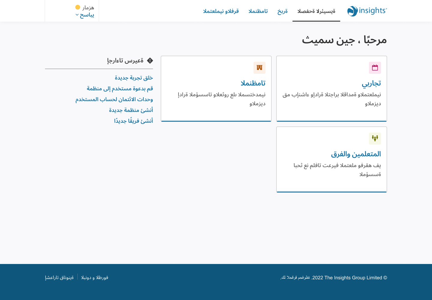
- Built and maintained a comprehensive and flexible design system that adapted to screen size, right-to-left languages and context e.g. administration systems, learning content, brochureware, etc.
- Undertook research efforts on a product few users had seen or understood at that point, often approaching audiences the business struggles to engage with, like recipients of their psychological profile products.
- Regularly pitched solutions to known problems that ultimately impacted overall customer experience.
Key learnings
- Attempting to save time in early builds can have a serious impact down the line, making features harder to deliver or create a lack of consistency.
- Planned workshops and experimentation as a team can develop skills and be a nice break from day-to-day delivery
- Continuous organisation is needed to keep designs that have been and are currently being implemented relevant and easy to find, particular when features worked on by separate development squads overlap.
- It’s important up to a point for designers to attend scrum ceremonies if developers find it useful but designers should feel empowered to drop off or not attend when the conversations aren’t relevant to them.


