Insights Discovery for Microsoft Teams began as an innovation incubator project in 2022, exploring how Insights products could be more effectively delivered for people working remotely. Insights profiles were expected to be delivered in classroom as part of workshops, with PDF files or printed documents being the only means of distribution. Customers frequently complained about the lack of follow-on activities afterwards, asking for a means to “keep the learning alive” day-to-day, so the potential benefits and investment made into improved awareness and communication wouldn’t be squandered. Insights had also previously struggled to launch digital experiences for end users of their flagship product and this was increasingly considered a glaring omission by customers.
With a high percentage of our customer base using Microsoft Teams (80%+), we landed on developing an extension for this software. Insights already had an abundance of platforms they expected audiences to access for specific purposes and meeting users where they already were with an integration was seen as a huge potential benefit. Once the business agreed to develop the app, a project team was established including representatives from design, research, product, engineering, operations and more.
After some early visioning and value proposition work, I developed three potential feature sets for product to review based partly on a newly available Customer API and the data it made available. These were packaged up as broad recommendations from the project team and helped inform discussions and drive decision making. A feature set focusing on existing customers was then finalised and agreed and we entered into a design phase.
While applications on Microsoft Teams do have a lot of freedom in the spaces they’re allowed to operate, I wanted the app to have a “built-in” feel. I’d used other Microsoft Teams apps in some early research and found that ones that deviated significantly from the core application UI and processes were unnecessarily jarring. And as the app was being developed by a vendor, there wasn’t an expectation we strictly stick to our established design system used elsewhere. My hope was the more we made our application feel like a part of Microsoft Teams, the more users would consider building day-to-day habits around it.
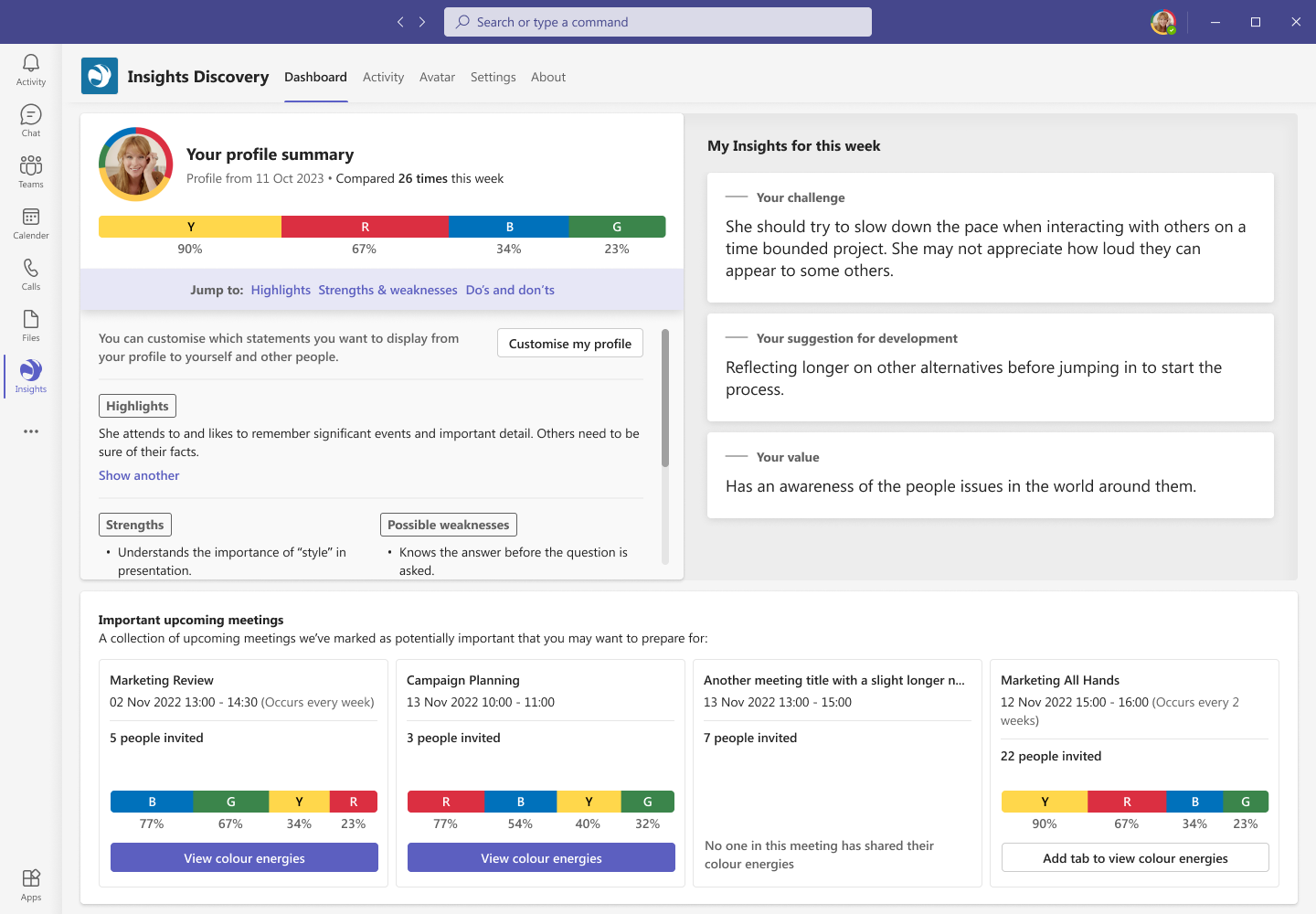
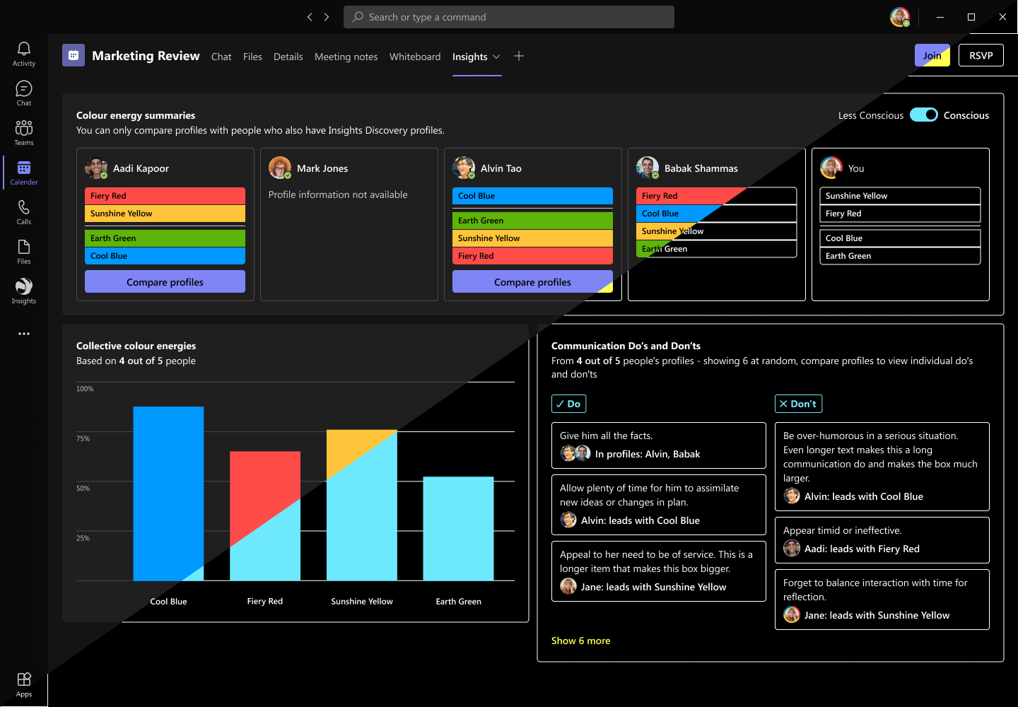
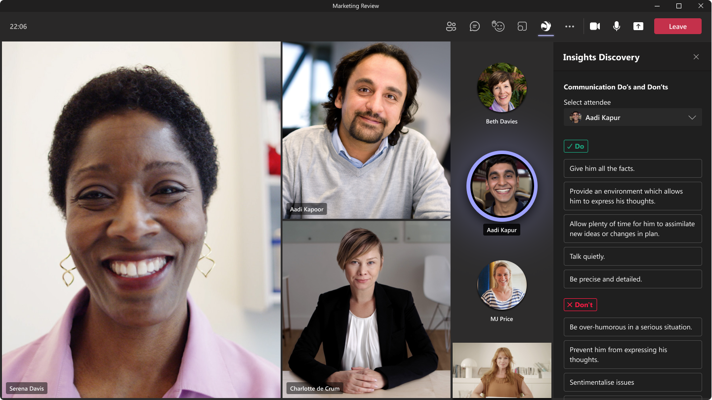
Due to some technical limitations we’d had explained to us by Microsoft developers, we had to find some means of encouraging users to add tabs. This isn’t something your average Teams user would find themselves doing regularly, and was a necessary part of our offering. Tabs would allow us to add a group-specific dashboard to various areas, namely meetings, chats or teams. This would give people who accessed it an idea of the individual and collective communication preferences in the space, allowing them to adjust and prepare. To push users to add these tabs, we displayed a customisable list of important upcoming meetings on a personal dashboard with tab related calls to action e.g. “Add tab to view colour energies”. We also sent out an automated instructions notification with advice on how to add tabs after set up and displayed a list of app features where instructions for accessing them included options like “Add tabs to meetings, chats or teams”. These restrictions also encouraged us to include an avatar generator which outlines a profile picture with a user’s personal colour energy mix. This would allow for increased visibility of people’s preferences throughout Microsoft Teams (and Microsoft products in general) without users being forced to constantly interact with our app.
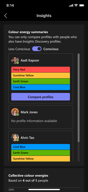
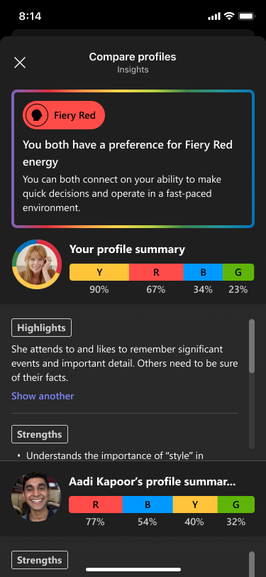
Once I had finalised a high-fidelity prototype and the project team had signed it off in principal, we started concept testing in partnership with user research. They conducted various interviews with customer and partner representatives and gathered feedback on our feature set. The initial reaction was very positive, but many expressed privacy concerns about our compare profiles feature. This allowed you to view key details from someone else’s profile in a group you both belong to (if you’d chosen to share it). To address this, we developed a profile customisation feature that allowed end users to tailor their profiles. They would be able to turn off specific sections or statements that they may not feel comfortable sharing with others (like potential weaknesses) but would still have the option to view that content privately for the sake of self development.
Another problem we needed to solve was giving our accredited practitioners and/or their staff the tools to resolve potential issues with profiles. End users may start to set up the app and their profile is not found or out of date thanks to various quirks with how customers manage their learner data. The Insights customer service team tends to do the heavy lifting here most of the time, but they weren’t going to belong to any customer’s Microsoft set up. I designed an “Insights representatives” feature to combat this. People with access to our systems at a customer’s end could opt-in for notifications and users on their set up who encounter a problem can send a support request directly through our Insights Discovery chatbot. I also wrote a guide for how to resolve each of these issues using our practitioner platform which we now provide as part of onboarding.
As I touched on earlier, Insights isn’t all that familiar or comfortable when it comes to launching digital products. When the app designs were finalised and we moved into development, a large part of my role in the project became internal documentation and promotion on top of liaising with the external engineering team. I presented the app and its features on a company-wide all hands to 500+ people and led an effort to recruit internal champions to help with its wider adoption. I wrote and developed materials for various audiences including setup guides for IT teams, FAQs for end users and more. These materials were used to familiarise audiences with the feature set, outline some ways the app can be used for exercises and onboard new customers and users.
The app has now been launched to a variety of select customers as it’s tested for ongoing stability and performance. Users love the compare profiles feature and the avatar generator. They use compare mostly to prepare for discussions with their bosses or for feedback conversations with peers. While some users have made the app part of their day-to-day habits, we have seen some significant drop off from initial launches. We intend to introduce nudge notifications via the chatbot to encourage users to try the app’s various features, as well as engage with it more often generally. Long term, the hope is that the app helps Insights retain customers and drives an increased appetite for and visibility of Insights products within organisations that adopt it.