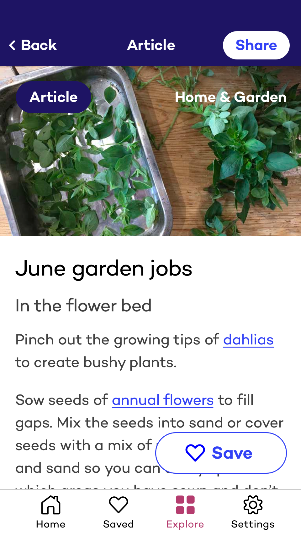
We began a project to rework Saga Possibilities in late 2019, applying feedback gathered through user testing to the original build of the app. The previous design featured several interactions that were deemed a little advanced for the target audience of people in their 50s and older, a group usually associated with poor digital literacy. Testing had highlighted issues with swiping partially obscured cards up to read more detail about offers, problems swiping left and right in carousels and the need for a way to sign out, as many users preferred to end each of their sessions due to vague security concerns. Designs for the mobile app were also produced at deliberately small screen sizes (iPhone 5/SE – 320 x 568) as several test subjects owned devices that were a few years older and this would help us maximise accessibility and support.
I redesigned the experience to cater more to the audience – large thick easily tapped content areas with clear distinctions between what is and isn’t interactive. The visuals were given room to scale for users who increase the text size on their phone, likely behaviour of our identified users and also a requirement of the WCAG AA accessibility we were aiming for. A new brand was also to be applied to these visuals, which was mostly developed for print, so there was some back and forth about how it should be applied to a UI. I continued to call attention to accessibility throughout this process, contrast checking new colour combinations in order to identify any which may need slight reworks to meet our agreed standards.
At this point, the main thing you could redeem through the app was restaurant offers. The Covid-19 pandemic and a change of Saga management meant that we were asked to shift the focus from dining to more of a companion app for your Saga membership. This meant another UI rework, the inclusion of new content types and laying the foundation for future proposed functionality (like a possible community area or the inclusion of holidays, insurance offers, etc). A comprehensive demo allowed Saga to effectively QA test the build and the app rework project was completed in around 2 – 3 months.


